How to Create Effective Infographics
There are many ways to create an effective infographic, but there are many more ways to create one that’s more confusing than it is helpful. Start with these tips:
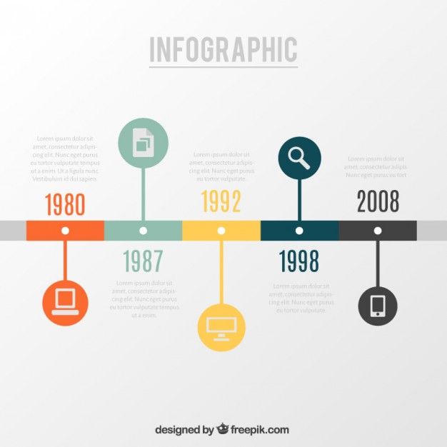
- Keep it simple. The idea of infographics is to make learning easier, so avoid overcrowding your visuals. Don’t be afraid to use whitespace, either. If you cram too many points together. See the infograph below.
- Create visual metaphors. For example, if your statistic is “1 in 4 people,” then your visual could show four stick figures with one highlighted. See the infograph below.
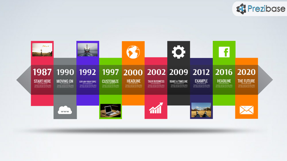
- Incorporate color to provide emphasis. Color is a powerful tool, and you can use it in your infographics to draw the eyes to important points. See below.
- Be selective about the charts you use. One of the biggest mistakes people make with infographics is choosing to use a chart that doesn’t represent their data well.
- Think about the flow. How does one point on the infographic relate to another? Think about how you can break up sections into chunks to make the content easier to learn. Use visual elements like boxes or different background colors to identify each section.

Assignment #2:
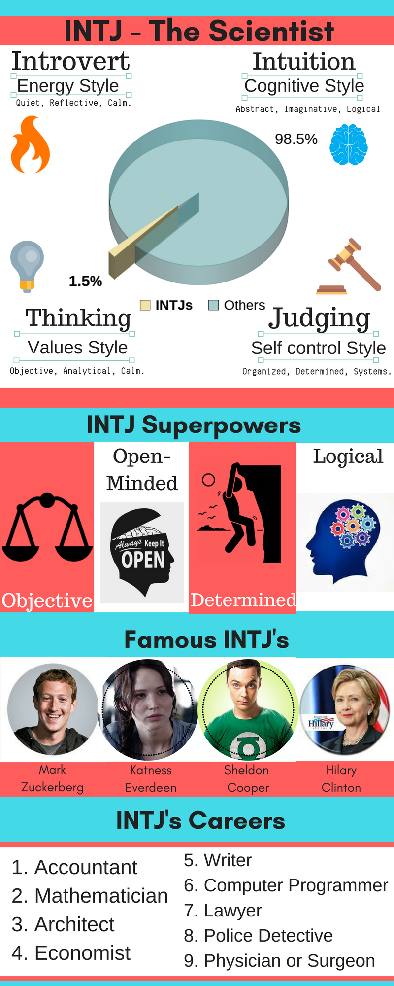
Create an infographic in Canva of your personality type. Besides the title you need at least 4 sections with information about your personality type. Make sure you use correct grammar and spelling. At least one section will need to show graphical information (a graph or table). I created an example below of my personality type.
When finished, post it on the Padlet. The link to the Padlet is on the x drive.